Appearance
Customize the look and feel of your April chat widget to match your brand.
Make the chat widget look like a natural part of your website by customizing its appearance.
Color
Set the primary color used for the chat header, send button, and chat bubble. Use your brand color for a seamless look.
Enter a hex color code (e.g., #4F46E5) or use the color picker.
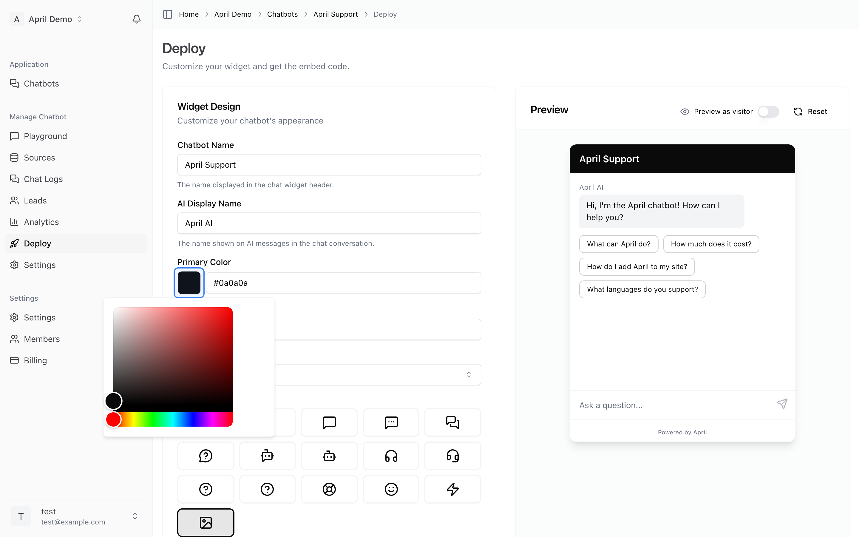
Position
Choose where the chat bubble appears on your website:
- Right (default) — Bottom-right corner
- Left — Bottom-left corner
Choose the side that doesn't conflict with other floating elements on your site (like cookie banners or help buttons).
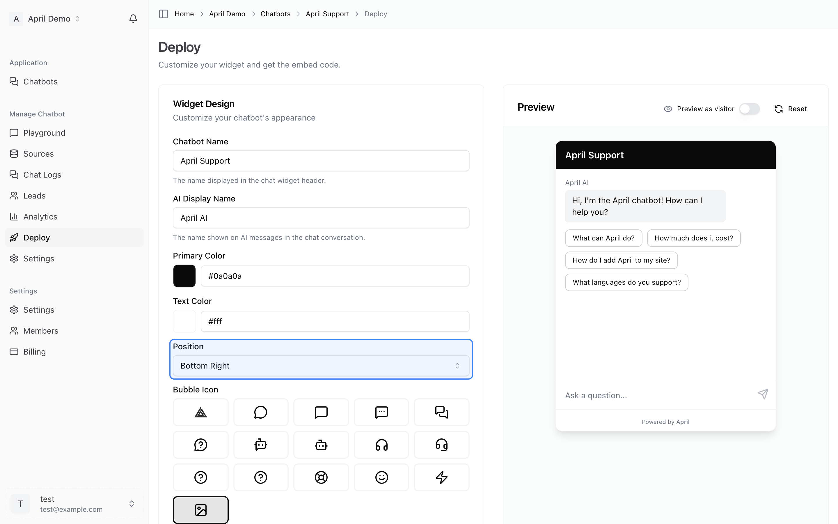
Title
The text displayed in the chat widget header when opened. This is typically your company name or agent name.
Examples:
- "Acme Support"
- "Ask April"
- "Need Help?"
Subtitle
Secondary text shown below the title in the header. Use this to set expectations.
Examples:
- "We typically reply instantly"
- "AI-powered support"
- "Ask me anything about our products"
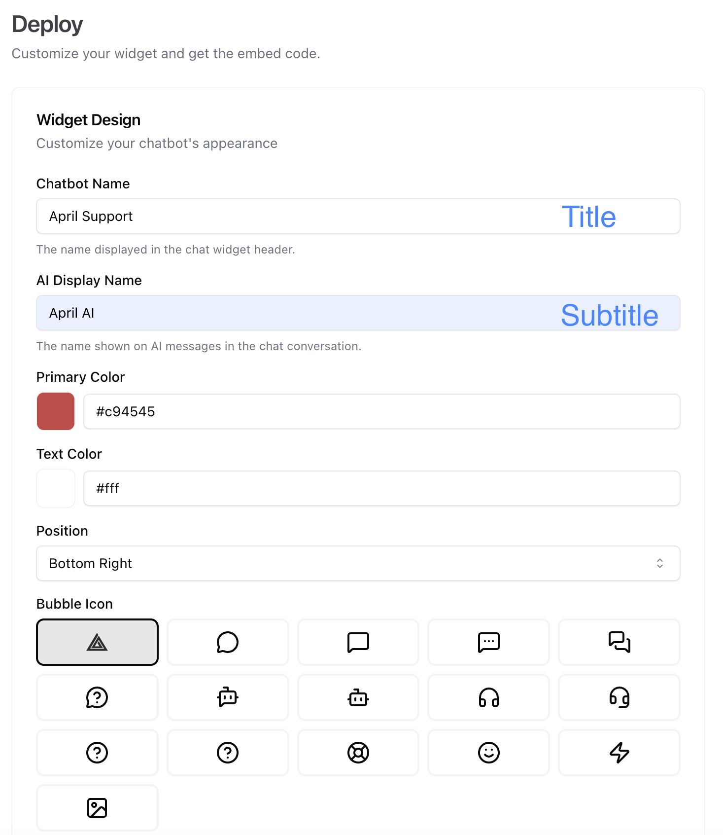
Bubble Icon
The icon shown on the floating chat bubble before a visitor opens it. You can:
- Use the default April chat icon
- Choose from preset icons
- Upload a custom icon (your logo, mascot, etc.)
A recognizable icon increases click-through rates.
Live Preview
All changes are shown in the live preview on the Deploy page. Test different configurations to find what works best for your website.